


For some those MTF charts are the holy grail when buying a lens. If as a photographer sharpness is important to you, then you must understand this stuff. Right, sharpness means different things to different people. MTF however is like a universal language. It’s the terminology used by lens designers. In the end it’s all about the complex interaction between resolution and contrast. For the optical designer, these two values are in conflict. Increasing one reduces the other. Every lens maker has a differing philosophy in this regard. It is said that Leica tends to favor maximum contrast while Zeiss is reputed to design their lenses for maximum resolution. In the end, that’s what gives a lens its character and the image’s “look.” Now what again is MTF? Here we go — MTF explained in plain English:
By ROGER CICALA, LENSRENTALS
This post contains absolutely no mathematics. Explaining MTF without math is sort of like doing a high wire act without a net. It’s dangerous, but for any number of reasons is more likely to keep the audience interested.
Why Am I Doing This Again?
I wrote an article on reading MTF charts several years ago. It focused on deciphering the MTF maps that many lensmakers publish when they release a lens, like the one below. But I get a lot of emails asking me asking me how to compare the MTF graphs we use in testing to the manufacturer’s MTF charts. Or asking me to show an MTF frequency chart (and if I show it, then lots of emails asking what it means). So I thought I’d write a quick post about the different types of MTF data and charts.
So first, an overview of the common types of MTF charts.
MTF Maps
I use the term “map” because the horizontal axis maps the lens from the center (’0′mm) to the edge of the frame (24mm). The colored lines show how certain MTF values change as we move from the center to the edge of the field of view.
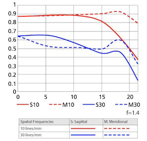
Except for the ones put out by Zeiss and Leica, these MTF maps are generated from computer models. Looking at the computer model MTF map is like looking at a retouched photo of a swimsuit model — in “real life” the curves are never quite as good as the image suggests.
A real MTF chart, put out for an actual lens, looks like the one below. Notice it has “0″ (the center) in the middle and goes to both sides, showing one dirty little secret: very few copies of any lens have exactly the same MTF curve on both sides.
What About Those MTF50 Numbers in Lens Reviews?
These days more people seem to pay attention to MTF50 tables generated by computerized target analysis, which appear on most review and testing sites (including this one).
Those are useful, of course, but now we’ve perhaps gone too far. People who don’t actually know what the MTF50 means think it means sharpest or even best lens, which isn’t absolutely true. Just like Mount Everest is a good, but not perfect definition of “the world’s tallest mountain,” the highest MTF50 is a good, but not perfect definition of “sharpest lens.” Depending on your definition of ‘tallest’, Mauna Kea or Chimboraza might actually be tallest.
It gets even more confusing. The MTF maps the camera makers put out, like the one at the top, gives MTF results in 10 and 30 lines/mm. Some people think MTF50 means MTF at 50 lines/mm, but it doesn’t. It actually gives you a completely different set of information.
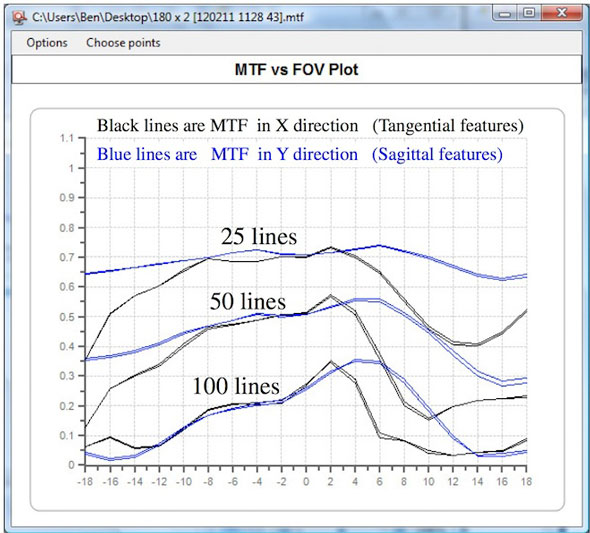
MTF Frequency Graphs
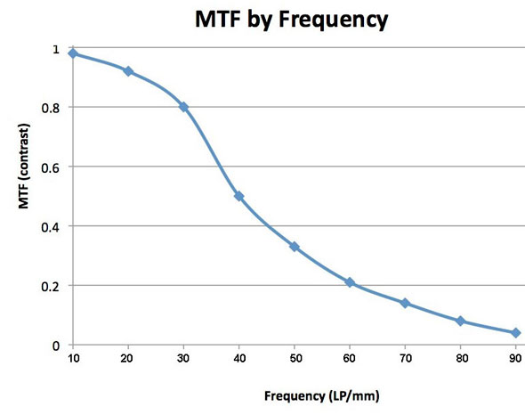
Finally, you sometimes see a frequency MTF graph for a lens, that looks something line this. It kind of looks like the MTF map I showed at first, but actually they have very little in common. The frequency graph shows you the MTF50, but adds a lot of additional data.
If you bear with me for a few minutes, I’ll explain what these various MTF numbers and graphs are showing us. If you like lab testing, this will let you understand the tests you more clearly. If you hate lab testing, it will still be worthwhile because you’ll be able to say things like, “The MTF50 numbers in that post don’t show anything about the fine detail resolution capabilities of the lens” in online discussions.
So What Are These Different MTF Numbers of Which You Speak?
They aren’t actually different MTFs, they are different ways of using MTF (Modulation Transfer Function) to show different information. Let’s start with a simple definition of the Modulation Transfer Function (MTF). We’ll do it without math, which will be better for everyone. For 95% of people it will be better because they can understand what they’re interested in. For the other 5% it will be better because they can break out various formula and make lengthy posts about why this definition is incomplete.
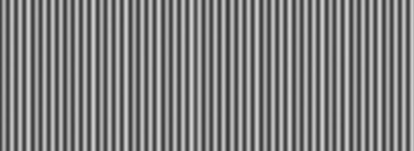
When a lens makes an image, it’s never a perfect image. For example, let’s start with some thick, black and white bars like this:
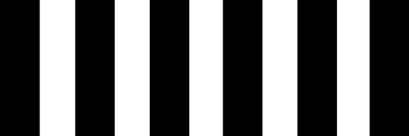
If I focus a lens on them, the image the lens makes looks almost, but not quite, the same, like this:
If you look closely, you’ll notice the second image is just a tiny bit blurry. If you measure it very carefully, you’ll find the black isn’t quite as black as the original, and the white not quite as white. You might not notice it on a computer screen, but the difference is there.
Now I’m going to show you the MTF formula without any math: MTF = contrast. We can make it just a bit more complex and more accurate without getting mathematical: MTF = blackest – whitest / blackest + whitest.
You can handle that even with some numbers, right? Let’s say pure black is 1 and pure white is 0. Since the original object is pure black and white we have (1 – 0 / 1 + 0) = 1. It’s perfection.
The image a lens makes isn’t quite perfect. In my example, the black is 98% as black as the original image, the white is 98% as white (or put another way, the white is now 2% black). If we plug that into the formula (you don’t have to, just showing you) it would be .98-.02/.98+.02=.96. So the MTF of this lens for these thick black bars is .96.
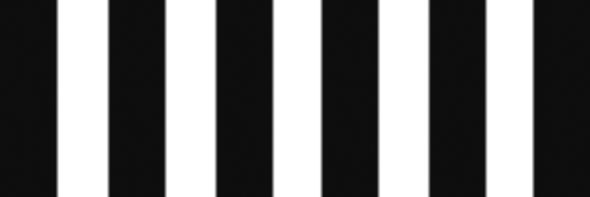
What if we use smaller bars put closer together, like the images below?
Lenses have more trouble as the bars get smaller. Pretty soon, the grayish blur from the edge of one bar starts to touch the edge of the next bar. The image looks like this:
Now the blackest bars in the image are 66% as black as the original, while the white areas are actually 34% black in the image. I won’t bore you with the formula, but the MTF for our close lines is .32. The difference between an MTF of .96 and .32 is pretty obvious just looking at the pictures, but the numbers make things more comparible. Saying “the MTF drops from .96 to .32″ tells someone else the results more accurately than if you said, “It goes from barely blurry to pretty blurry, but I can still count the bars.”
What About Those Line Pair Things
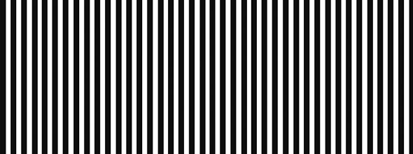
If we want to be all scientific, we can’t just use some arbitrary “thick lines” and “thin lines” like I did above. We need to quantitate them, and the quantity we use is lines or line pairs per mm. It’s the same thing, basically; a line pair is a black and white line, a line would just count black lines.
The “per mm” part is mm at the image plane. (The camera sensor is at the image plane). If everything were perfect, the test target would show X number of lines across each mm of the image plane. Thick lines, like the first example, might be 10 lines per mm. Thinner lines, like the second example, might be 40 lines per mm.
The lines per mm count is usually referred to as the “Frequency” or “Spatial Frequency.” So now we have two things we’re looking at: the MTF, which is a measure of contrast, and the Frequency, which is how small the lines were that we used to measure the contrast.
At a single point on the lens (right at the center, for example) I can measure the MTF at different frequencies (line pairs) and make a nice graph of the results. Remember, this isn’t across the entire front of the lens like the very first graph. This is measuring one point on the lens at different frequencies (smaller and smaller lines). Every lens, like the graph below, has lower MTF as the lines get smaller (the frequency gets higher).

If you look at the left side of the graph, the MTF (contrast) measurement, it’s a simple matter to find the MTF50 (or MTF 10 or MTF90 for that matter). It’s simply the frequency (lines per mm) at which the image retain 50% of the test target’s contrast. (Or 10% or 90% of original contrast form MTF10 or MTF90).
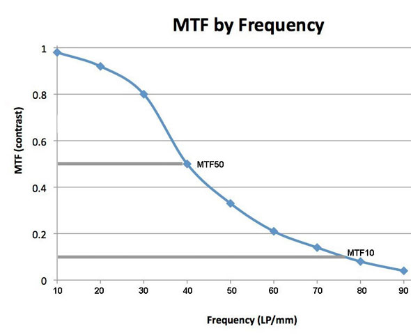
In this example, the MTF50 is about 40 LP/mm. When I (and most current reviewers) report the MTF 50, this is what we’re showing you. Most of us use LP/Image Height rather than per mm, so we just multiply LP/mm by 24 (since a full-frame sensor is 24mm high). So in one of my standard reports for this lens I’d say the MTF50 was 960 LP/IH, which is quite good. But my reports wouldn’t tell you the MTF10 is about 77 LP/mm, or the MTF90 (which doesn’t have a gray line in the image above) is about 22 LP/mm.
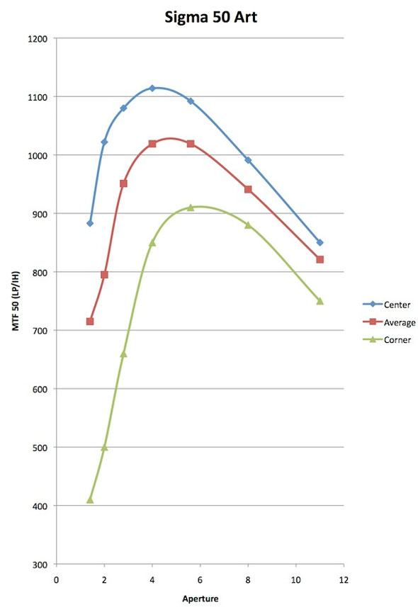
Also, remember the Frequency graph is for just one point on the camera lens. When we post a set of bar graphs showing center, average, and corner MTF50, we’re showing you the MTF50 at different locations.
So Is the MTF50 the Most Important Number?
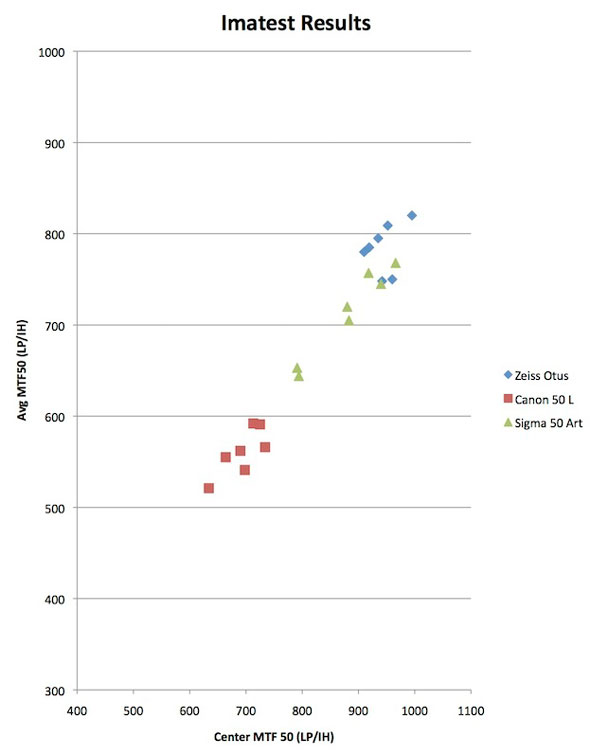
Why do we lens testers give you the MTF50 numbers? Well, the first reason is it’s the default reading in Imatest software, so it’s simple and easy. There’s also the fact that most of the lens testers use it and people like to be able to compare results from different testers, so there’s kind of an MTF50 gentleman’s agreement going on. Plus, 617 different graphs showing MTF everything at lens locations Everywhere just cause an article to be confusing and chaotic.
But the truth is that MTF50 is a probably the most important overall MTF number when evaluating a lens. MTF50 is has been shown in numerous studies to be the point where humans perceive an image to be “sharp” rather than blurry. That makes sense – it’s basically where the contrast is greater than 50%.
But MTF50 is not the only important number. Those other frequencies give us different, but important, information. Lower frequencies, like MTF 80 to 90, show how “contrasty” an image is. If you photograph large, bold structures, this area of the frequency curve may be more important to you than the MTF50.
Numbers like the MTF10 or MTF5 are the absolute resolution limit of the lens. They show what the smallest detail is that the lens can possibly resolve. Anything smaller is just smooth gray blur. Trained human observers and image enhancement programs can actually make out some details at MTF5 in a photograph, but most of us need MTF10. Landscape and macro photographers trying to get the most detail in their large prints might consider MTF10 to be more important than the MTF50.
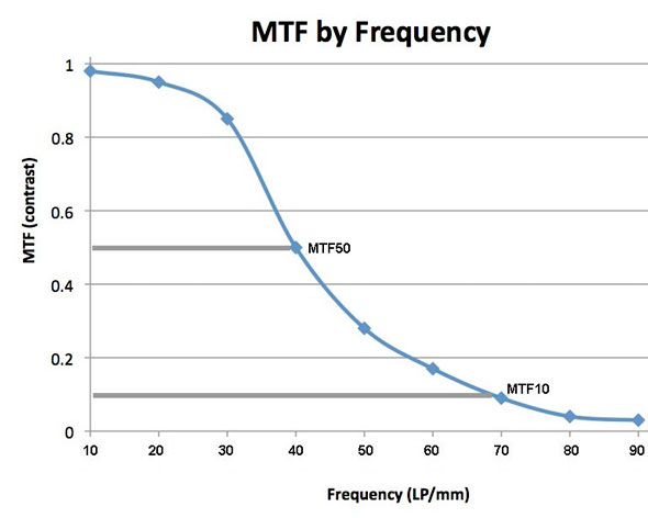
For example, here is a frequency graph of another lens that has exactly the same MTF50 as the lens above, 40 LP /mm. However, the MTF10 is lower (about 69 LP/mm compared to 77) and the MTF90 is higher (30 LP/mm compared to 22). So this lens should be more contrasty but not resolve tiny detail as well as our first lens.
Some lenses with very high resolution have rather poor contrast. Other lenses have very good contrast, but their resolution is poor. Stated another way, some lenses have very high MTF10, but poor MTF80. Other lenses have great MTF50 and MTF30, but low MTF10.
One Point
It’s really important to emphasize that the MTF10 in these frequency charts is completely different than the MTF at 10 lines/mm in the MTF map of a lens I show at the very top of this post. The MTF at 10 lines/mm (in the MTF map at the top of the article) is showing you how much contrast thick lines have at various positions as you go from the center of the lens to the edge. The MTF50 in the frequency graph is showing you how small the lines can be that still retain 50% of their original contrast.
So Why Am I Bringing This Up Now?
Because it’s time to improve. Like everyone else we’ve been showing MTF50 results from Imatest shot at fairly close range charts. That gives us a number for the whole system (camera and lens) in a map across the front of the lens.
Soon we’ll be adding optical bench results to our Imatest results when we test lenses. This will allow us to look at several other things: the performance of just the lens rather than the lens-camera sensor combination, the performance at infinity focusing distances rather than close up, and MTF at different frequencies among them. We’ll even be able to create front element MTF maps of the lenses we test, and compare those to the computer generated MTF map of the manufacturer. That should be fun and interesting. Well, it will be fun and interesting for us. I’m guessing maybe some manufacturers won’t be so crazy about it.
When we test lenses we’ll continue to show you the same MTF50 data that we’ve been showing and that everyone else shows. It’s important data and we already have a huge database of MTF50 data for lots of lenses so it’s great for comparison. We’ll also be adding Frequency MTF charts for the center of the lens, and probably for one or two points off-center. We don’t have a big database of this information yet, but I’ll be able to give you some comparisons to one or two similar lenses.
Since we’ll be showing things besides simply the MTF50 map of the front element, I wanted to show what those other values meant and why that is worthwhile information. The bottom line is we’ll be able to give a more thorough evaluation of lenses than we’ve ever been able to do.